

Our picks for the most intriguing companies of Y Combinator’s latest batch were based entirely on substance and our endless expertise, so it’s time for something much more superficial. Here are the 11 best logos from the hundreds of companies that presented yesterday.
Watching companies go by 60 seconds at a time for like eight hours was pretty mind-numbing, even when a lot of them were cool, but I always perked up when I saw something with a nice logo. So I started marking them down, and sure enough soon a post appeared.
Sadly many of these will be bought in short order and their cool logos retired, like what happened with my favorite recent logo, DataFleets. I guess it isn’t really sad because they all get super rich, but there goes a perfectly good logo, you know?
Anyway, let’s proceed. These aren’t in any particular order except that the first three are my favorites and the rest all tie for fourth.
Enombic
A capital E always makes a lot of interesting geometric possibilities available. Enombic’s logo makes the most of this famous trisulc optical illusion while not overdoing it, giving a clear (if impossible) shape that is also obviously a letter — without any extraneous lines or materials, in fact with the absolute minimum. The clean type is also well-chosen (and avoids repetition by changing case). Gold star.
Uiflow
![]() This isn’t the first time a U and I have been joined in this way, but it’s done here very elegantly and with complementary curves and spacing in all the right places. They use the inversion of the above as well, but I think white on black looks better than black on white.
This isn’t the first time a U and I have been joined in this way, but it’s done here very elegantly and with complementary curves and spacing in all the right places. They use the inversion of the above as well, but I think white on black looks better than black on white.
Perfect Recall
 Here’s one where the logo is informed by the purpose of the company, which records and highlights video calls. A loop with an arrow is a universal cross-lingual symbol for returning to something, and there are a few ways to do this that are flashier but don’t look as good. Getting the effect of a circle and not just a semicircle without compromising the shape of the P is a tough thing to balance. This logo does have the awkward side effect of putting a recognizable P right before the P in perfect, so you end up with PPerfect Recall. It happens a lot, but still something to watch out for.
Furmacy
 Another logo actually informed by the company’s purpose, this one combined with the logotype could do with a little more work (the tail curve bothers me, the plus is too much, and the Dr Mario player in me wants a solid lower capsule half) — but it’s immediately recognizable and adequately communicates what the company does wordlessly, a rare quality. Got to hand it to them for the name, too.
Routine
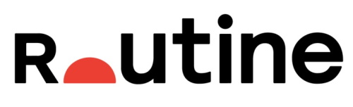 It’s a bold decision to leave off half the “o” in any situation, since it can quickly become another letter or symbol if you don’t do it right. In this case using it as a rising sun works really well, also suggesting the purpose of the app. Having an uppercase R the same size as the lowercase letters is normally something that would really bother me, and might have gone badly, but it works here because of the white space left by the o. Not perfect, but surprisingly palatable.
Dashlabs.ai
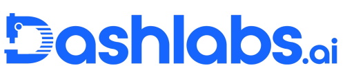 I liked the idea of this one, but the graphic needs simplification. The proportions are off with the eyepiece, lens barrel and plate, and the dial is one element too many. I like the slotted D, but there’s something off about it. Maybe it’s an optical illusion, but some of the stripes look thicker than the others. Actually, now that I look closely it’s super obvious someone left an extra pixel on the bottom layer. The geometric type is solid too, but lose the .ai, it’s small and weird. Just… Dashlabs.
Mendel
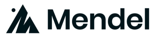 This one truly seems to have no connection whatsoever to the company, or even the famed geneticist, but I just love the M-mountain. It would have been legendary if Mendel made hiking boots or camping gear (not too late for a pivot). This kind of letter-art is surprisingly rare to find done well, and this is really just on the charming side of primitive, but you can see the thought that went into it. The type isn’t great, though — I can’t stand those billowy d’s.
Nuntius Therapeutics
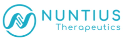 DNA’s double helix structure (tied in with Nuntius’s gene therapy) can be used to create lots of forms, but this capital N is really a nice one. The stylized bases aren’t exactly biologically accurate, but they work well and the sinuous curve of the helix flows beautifully into the circle.
Aspen Cloud
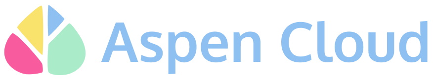 The muted rainbow has been used to death, but apparently they just didn’t mute it enough. Aspen Cloud goes all the way into pastels, but they’re harmonious enough that they suggest CMYK rather than other polychromatic logos. The leaf-tree combo is simple and memorable, they avoid weight and symmetry problems and the colors are nicely arranged. On a white background it recedes harmlessly and on a black one it pops. Can’t say the same about the type, though. Can’t really say anything at all.
PingPong
![]() I hate this high-visibility color when it’s on the stupid Uber bikes that litter my neighborhood, but I have to say, it makes for a great dot. The full logotype is nothing to write home about (any logotype for a company called “ping pong” that doesn’t utilize some kind of symmetrical or two-sided motif is a waste), but what I assume is the app logo is great. The darker grey tone does a lot of work — it establishes a sort of “off-camera light” that casts a shadow, and because it’s ever so slightly narrower than the dot/ball, it gives an illusion of depth as well. I suppose it could be interpreted as being the flight line of the ball (i.e. it is zooming up and to the left) but I like my way better. It also might be a little too close to the flag of Japan.
I hate this high-visibility color when it’s on the stupid Uber bikes that litter my neighborhood, but I have to say, it makes for a great dot. The full logotype is nothing to write home about (any logotype for a company called “ping pong” that doesn’t utilize some kind of symmetrical or two-sided motif is a waste), but what I assume is the app logo is great. The darker grey tone does a lot of work — it establishes a sort of “off-camera light” that casts a shadow, and because it’s ever so slightly narrower than the dot/ball, it gives an illusion of depth as well. I suppose it could be interpreted as being the flight line of the ball (i.e. it is zooming up and to the left) but I like my way better. It also might be a little too close to the flag of Japan.
MagicBell
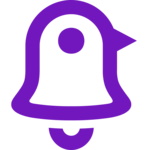 I don’t know why this works, but it does. The bell combined with the chicken takes two “alarms” and makes them one cute item that screams (or rather crows) “notifications.” Or possibly “Peeps.” Let’s just hope Nintendo doesn’t sue them for infringement of a bunch of the bird-type characters in Animal Crossing (especially Knox).
Good work to all these companies and the many more I only didn’t list because I got tired. Design is important, not just for catching the user’s eye, but because it indicates attention to detail and an approach beyond the purely functional — something startups often struggle with.
Article originally published http://feedproxy.google.com/~r/techcrunch/startups/~3/0PT7ndDHAjo/

